
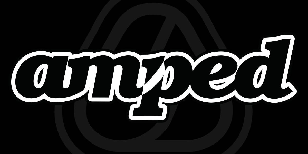
Originally starting out as an action sports brand I wanted to create a logo that was inspired by a number of key sports that the brand would be involved in, such as Moto, BMX, Surf & Skate. You can see the influences of waves, ramps and movement in both the logotype and the icon.
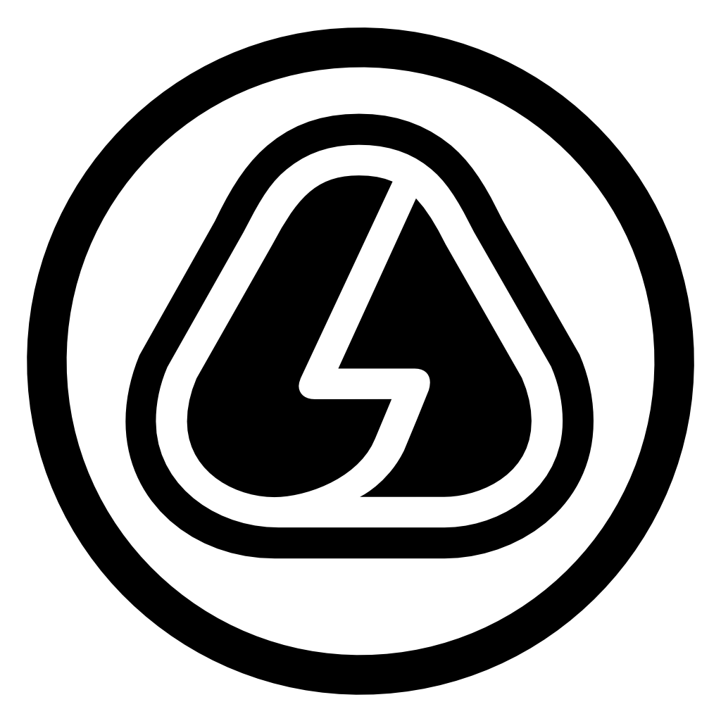
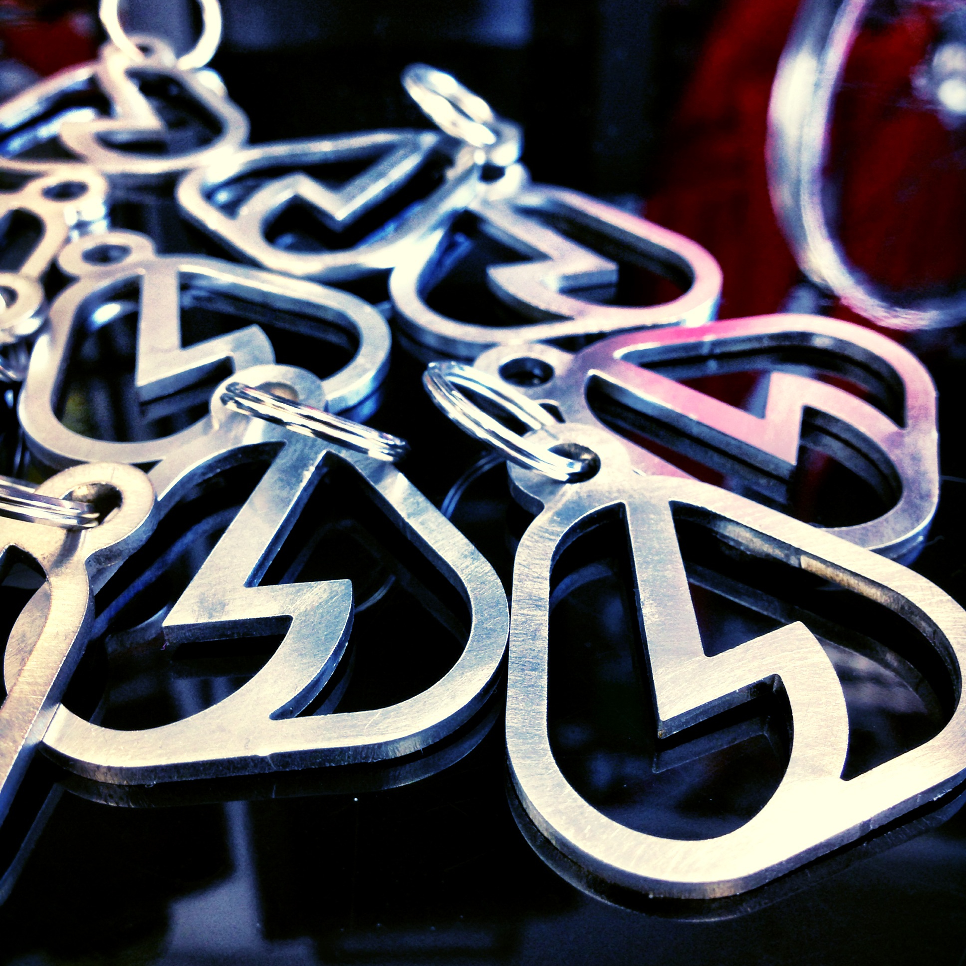
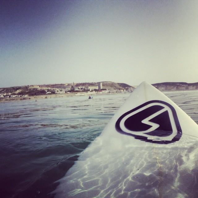
As with the original logotype, I also wanted an icon for the brand which would be suitable for as many different use cases as possible. Again inspired by waves, ramps and movement, the icon had to be something that would easily fit on a varied range of things such as apparel, bikes, helmets, boards, vehicles and more.
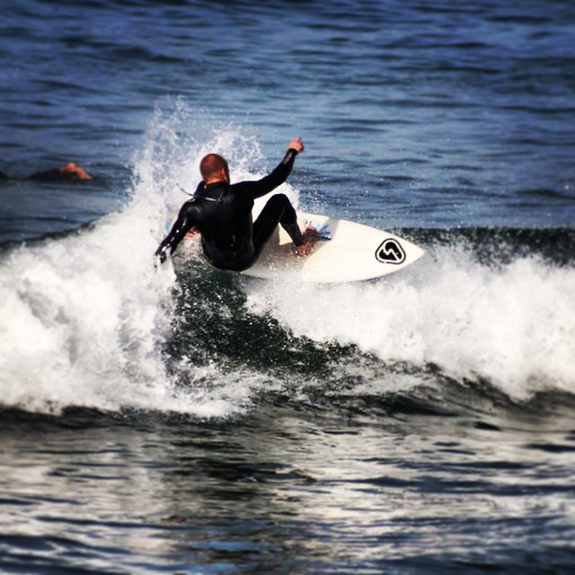
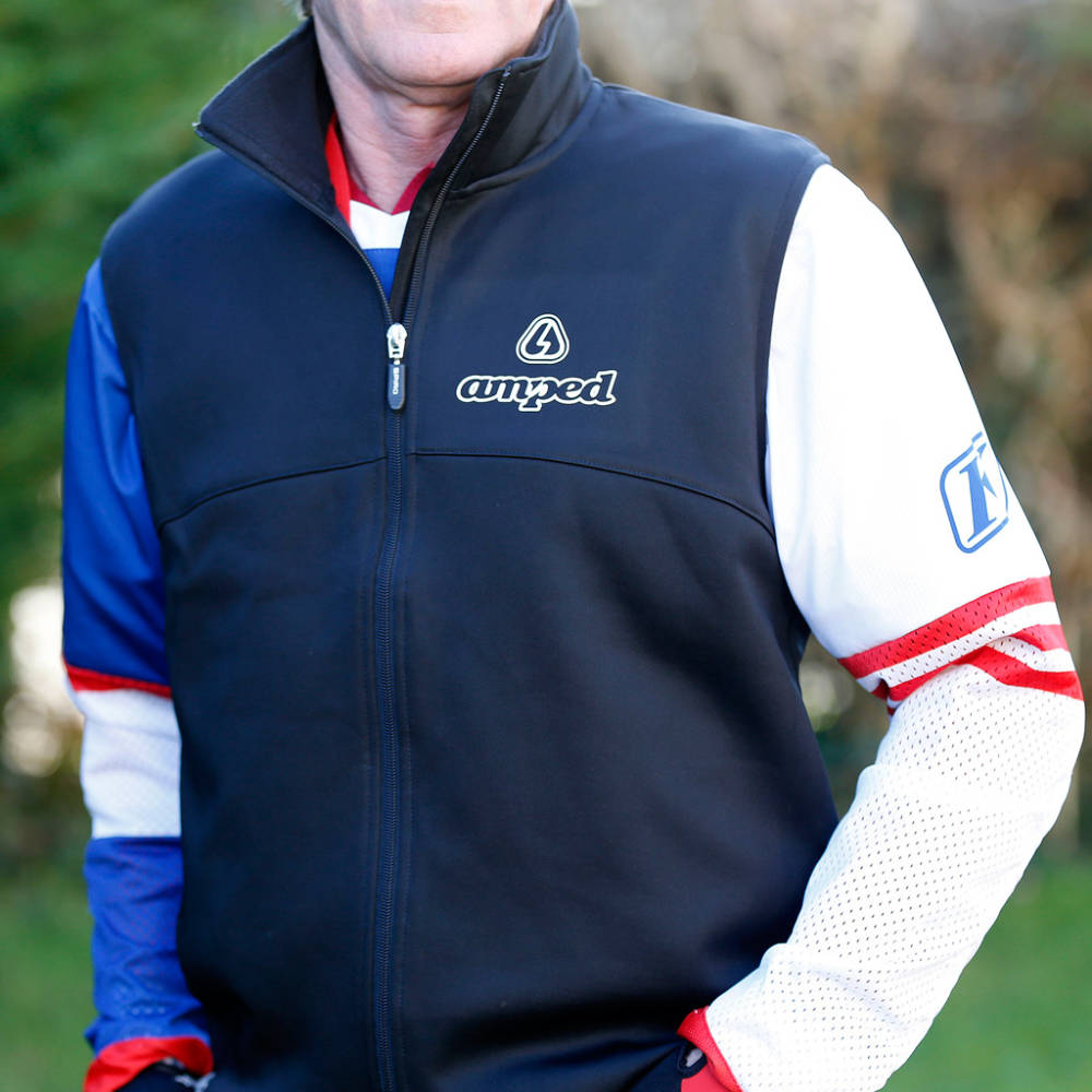
My passion for offroad motorcycle sports such as trials and motocross meant that the Amped brand naturally evolved and grew specifically in this market. A big step was moving into the world of motocross graphics/decals, growing into one of the UK's leading motocross graphics providers and working with some of best riders in the World.
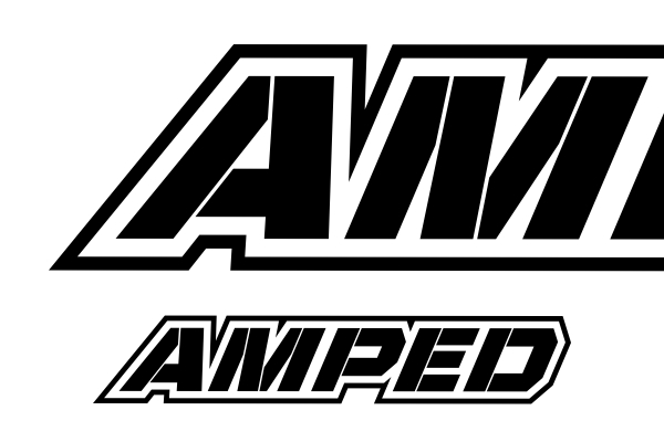
I decided to create a second version of the Amped logotype that was geared more towards the offroad motorcycle market with a racier feel and to allow for easier application on bikes. When it comes to decals on motorcycles you have a few specific positions on the bike that are key points to place logos for maximum exposure, and the new version fitted within these key positions much more effectively.

Follow on Instagram
Email:
© Copyright 2021 Daniel Oliver. All rights reserved.